When you look at a watch, you may notice its case, dial, hands, or bracelet first. But there is another small detail that can tell you a lot about the watch: its logo. The best watch logos do more than show a brand name. They can represent history, craftsmanship, precision, luxury, or a clear design philosophy.
So, what makes a watch logo iconic? It typically involves three key elements: a strong story, meaningful symbolism, and consistent branding. Think of the Rolex crown, Patek Philippe's Calatrava Cross, Omega's Greek letter Ω, and Vacheron Constantin's Maltese Cross. These symbols have become closely connected with the identities of their brands.
This guide will discuss the history and the meaning of the most famous watch logos, why they are memorable, and what can be learned by modern watch brands. We will also look at how Leitzeit connects its branding to timeless mechanical watch design.
What Are Watch Logos and Why Do They Matter?
The name, symbol, monogram or graphic identity that identifies a watch brand is referred to as a watch logo. It is typically displayed on the dial, although a brand can also display its logo on the crown, movement, case back, packaging, website, and other products.
An effective watch logo makes you identify a brand easily. It is even possible to recognize a watch by its logo before you read the name.
Consider a crown at the 12 o'clock position. Rolex will be the first brand that comes to mind for many watch lovers. The Greek letter Ω will lead you to Omega, and the Calatrava Cross can make you remember Patek Philippe.
This awareness builds up. A brand employs a logo on its watches, advertising, packaging, stores, websites and other resources repeatedly. The logo is more recognizable as the customers view the same visual identity repeatedly.
A powerful watch logo can convey:
- Heritage and history
- Craftsmanship
- Precision
- Luxury
- Technical expertise
- Reliability
- Adventure
- Modern design
- Brand personality
The logo should also be able to work within a compact area. A watch dial is a restricted space to be used by designers, and a straightforward and simple design can be the most effective.
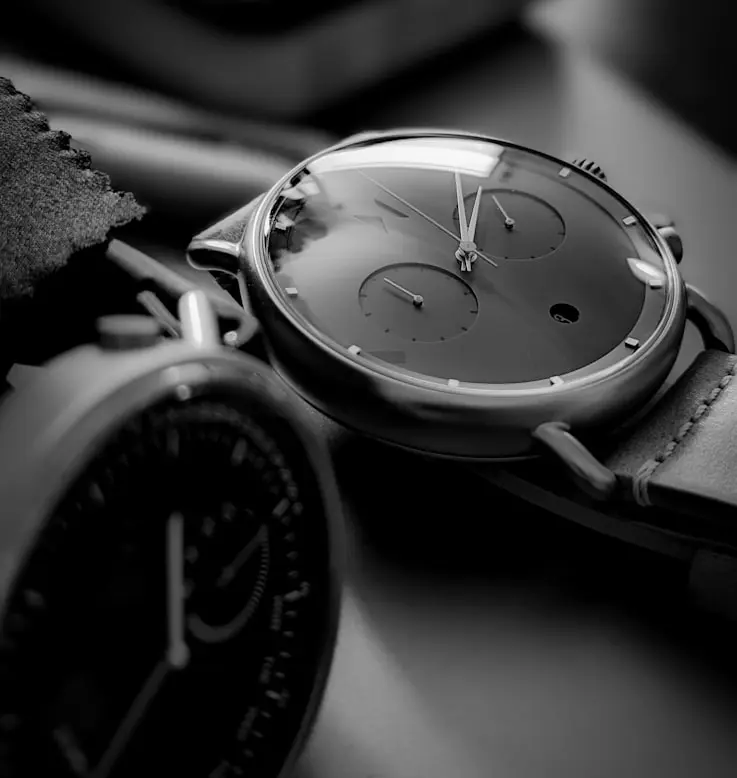
How Did Watch Logos Evolve Through History?
Watch logos were not necessarily the refined symbols that we have today.
Early watchmakers frequently identified their work with names, signatures, initials, or maker marks. With watchmaking becoming a bigger global industry, brands required better methods of differentiating their products.
Gradually, plain names evolved into familiar visual identities. Other watchmakers used symbols that were based on historical references. Others used typography, initials, or company names.
Advertising was also a factor. An identifiable logotype might appear in magazines, shop windows, ads, and packaging, and subsequently on websites and social media.
This helped transform a simple maker's mark into a recognizable global brand.
The best watch logos often connect to something important. The more customers can relate a symbol to a history, product, engineering, or value of a brand, the more memorable it becomes.
The Stories Behind Famous Watch Logos
Now we can consider some of the most famous watch logos and their histories.
Rolex Crown Logo: The Symbol of Prestige
The Rolex crown is one of the most well-known luxury watch logos in the world.
Rolex registered its crown logo in 1931. The Rolex dials featured the symbol in the 1930s and it was subsequently incorporated into the overall visual identity of the brand.
A crown naturally brings to mind ideas of prestige, achievement, power, and status. Nevertheless, the symbol was strong, as Rolex always linked it with its watches, advertising, technical development, and long-term brand identity.
Today, when you see the crown, you can recognize the brand even before you read the name Rolex. shows the real strength of an iconic logo. Such a plain form can turn out to be a visual shortcut to a whole brand.
Another valuable branding lesson that can be learned with the Rolex example is that a symbol gains strength through its constant usage and a powerful product behind it.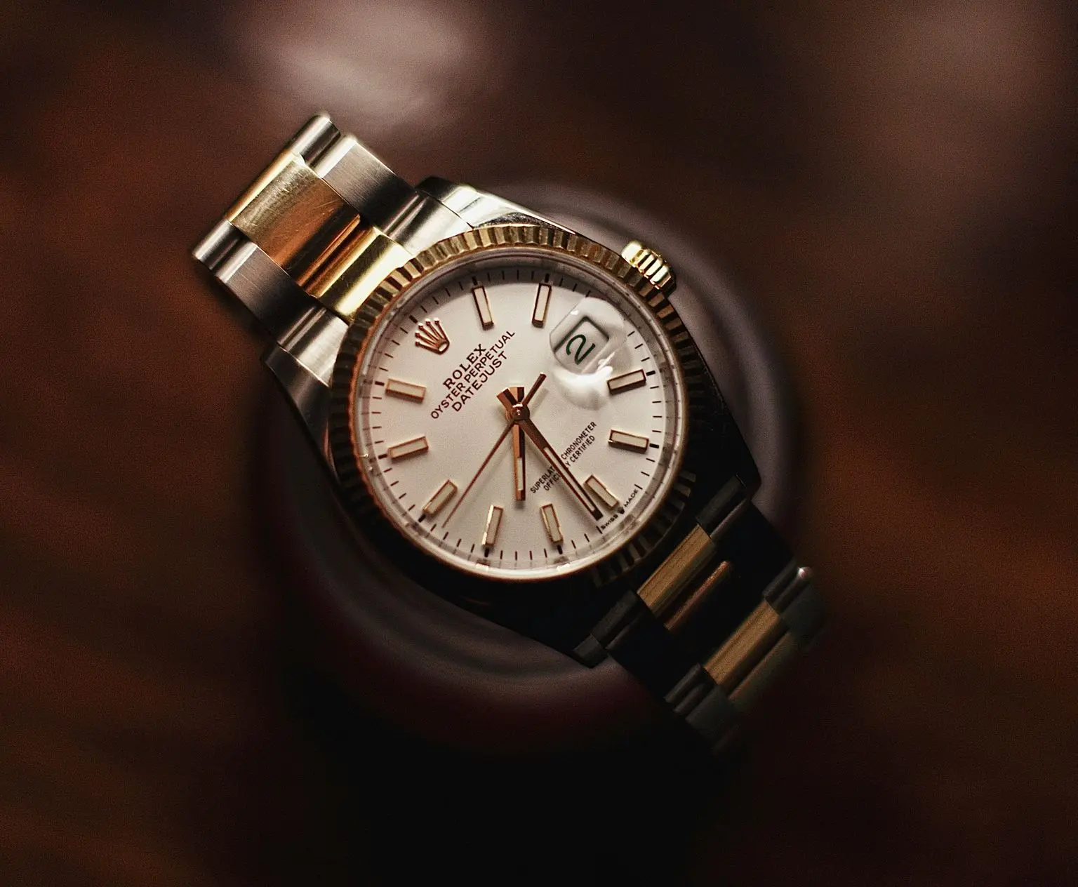
Omega Ω Logo: The Symbol of Completion
Omega employs the most basic symbol in the world of luxury watches: the Greek letter Ω, or Omega.
The logo's story closely connects to the company's watchmaking history. In 1894, the Brandt brothers came up with a significant movement known as Omega. It was successful and contributed to making Omega the name of the company.
The Greek letter Omega also symbolizes the end or completion, as it is the last letter in the Greek alphabet.
This makes the logo an intriguing mix of history and symbolism. You are not looking merely at a decorative letter. The symbol relates to the name of the brand and the development of the watches.
Omega also uses a hippocampus emblem on many Seamaster models, linking the collection to its maritime and diving heritage.
Omega demonstrates the way a brand can employ various symbols to represent various aspects of its identity and retain the primary logo uncomplicated and easy to recognize.

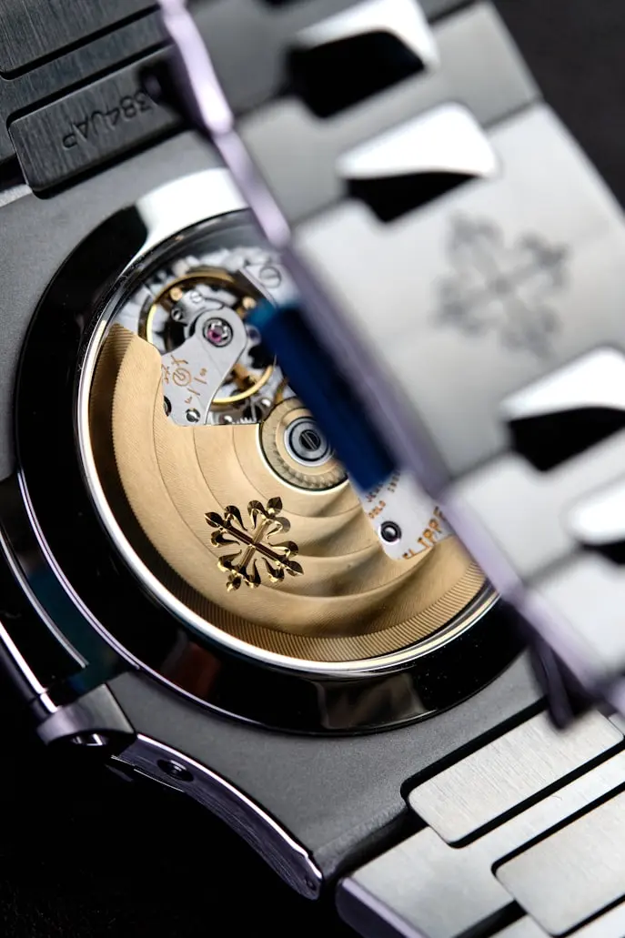
Patek Philippe Calatrava Cross Logo: A Heritage Symbol
The Patek Philippe Calatrava Cross is a prime example of a historic watchmaking emblem.
In 1887, Calatrava Cross was registered by Patek Philippe as a trademark. The emblem has been an essential aspect of the company for over a hundred years.
The symbol has evolved a bit with time, but the fundamental identity has been recognizable. The Calatrava Cross conveys the message of tradition, heritage, and craftsmanship. The emblem is also available on other places of the Patek Philippe watches, such as the winding crown and the movement components.
This approach makes the logo part of the physical watch rather than simply a graphic printed on the dial.
It also demonstrates how an old symbol can be kept alive as long as a brand employs the same symbol over time.
Vacheron Constantin Maltese Cross Logo: A Symbol From Watchmaking
The Vacheron Constantin Maltese Cross is a story with a fascinating history, as it can be directly related to the mechanical watchmaking.
In 1880, Vacheron Constantin became the emblem of the Maltese Cross. The design was inspired by a movement part that was used to regulate the unwinding of the mainspring and assist in enhancing the regularity of timekeeping, according to the brand. This association provides the logo with a technical meaning.
Rather than picking out a symbol because it appeared classy, the brand related itself to a real component of a mechanical watch.
That is why the Maltese Cross is a powerful illustration of how the watch logos can transform the history of engineering into visual branding.
Vacheron Constantin, too, has a long history of watchmaking, dating back to 1755, and the logo is closely associated with the long history of the brand.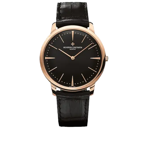
Leitzeit Logo: Timeless Design and "Guiding Time"
The name "Leitzeit" comes from the German word associated with "guiding time." This idea forms an important part of the brand's identity, connecting time, design, mechanical engineering, and everyday life.
The Leitzeit visual identity reflects a broader philosophy of timelessness and thoughtful design. Instead of relying on created heritage, the brand focuses on mechanical watchmaking, German design, manufacturing transparency, and long-term value.
Leitzeit also takes a modern and global approach to watch design and manufacturing. Information about the design and manufacturing process is openly discussed, giving customers a clearer understanding of where and how the watches are assembled.
For Leitzeit, a logo represents more than a brand name. It reflects the values behind the product, including timeless design, mechanical watchmaking, engineering, and long-term usability.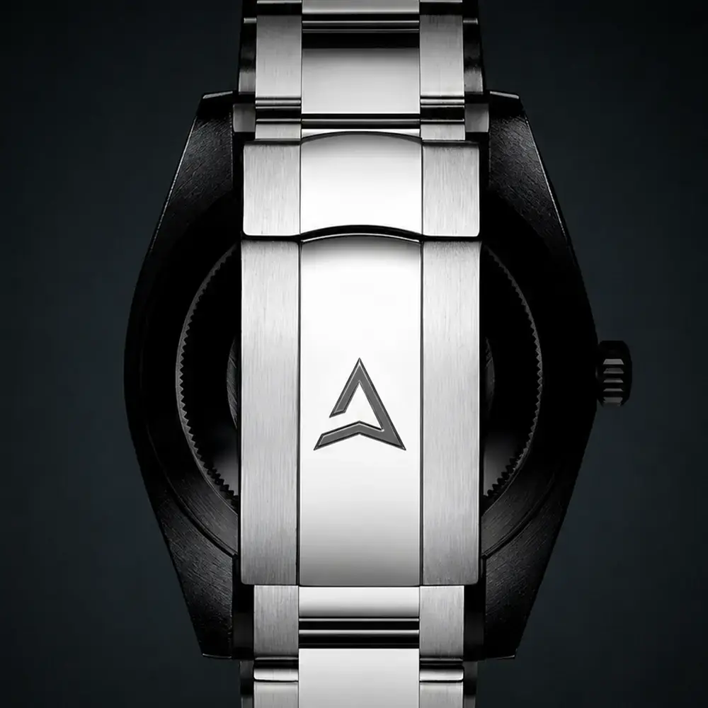
Cartier Wordmark Logo: When Typography Becomes an Icon
Cartier does not follow the path of other brands that use an independent symbol.
Its unique wordmark has been a significant aspect of its luxury.
The flowing lettering forms a beautiful visual signature that is applicable in watches, jewelry, packaging, stores, and advertising.
This design is an example that a watch logo does not have to include a crown, cross, animal, or other graphic symbol to be iconic.
A well-thought-out wordmark can also be recognizable when a brand employs it over a period of years.
Cartier demonstrates, too, how typography can relate watchmaking to a broader language of luxury design.
Its watches are closely associated with the overall design heritage of the company, and thus the wordmark is a component of a much larger visual identity.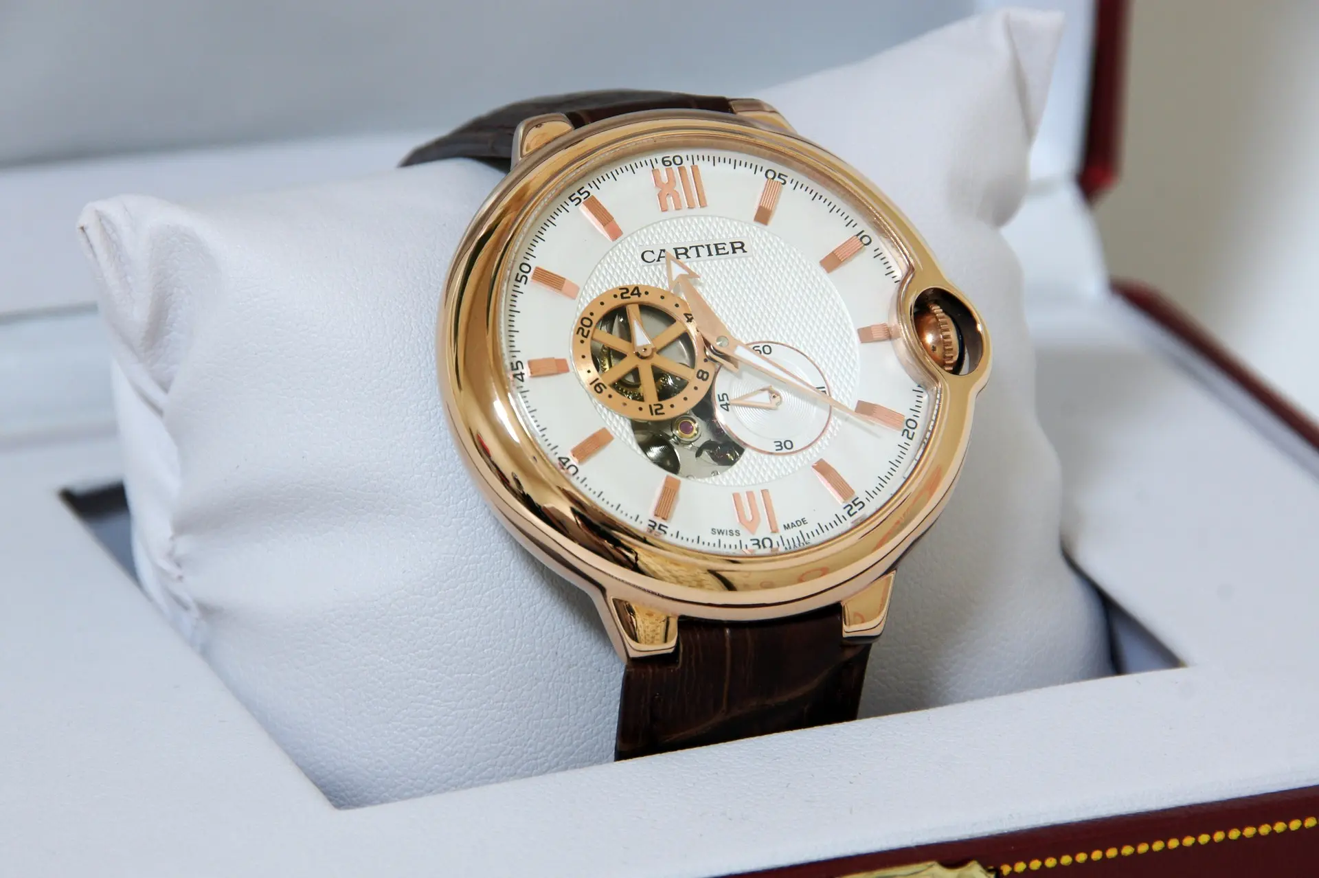
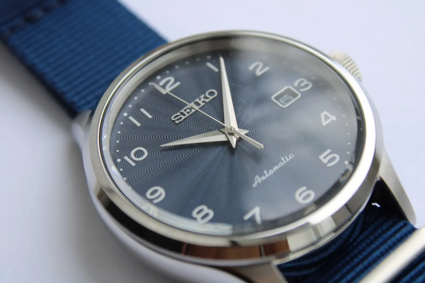
Seiko Wordmark Logo: Simple and Recognizable
Seiko has a clean and recognizable wordmark on its watches and in the wider brand identity.
The simplicity is effective since customers can easily read and identify the name.
Seiko also provides an important advantage in comparison to the traditional Swiss luxury brands. You do not have to have a complex historical symbol to build effective brand recognition.
A plain wordmark can become a brand to be remembered when it is used consistently, has a good product, is technologically developed, and has a long history of being in the market.
This is a good lesson to the contemporary watch brands: occasionally, simplicity can be more memorable than complexity.
Audemars Piguet AP Logo: The Power of a Monogram
The AP initials give a concise graphic representation of the name of the company.
The use of monograms is especially effective in luxury branding as it can produce a sense of exclusivity and individuality. They can be applied on watch dials, movements, packaging, accessories, and other brand materials without consuming a lot of space.
The Audemars Piguet case demonstrates that a simple set of letters can serve as an iconic logo instead of a complex symbol.
It also shows how a brand can make its initials a recognizable signature.
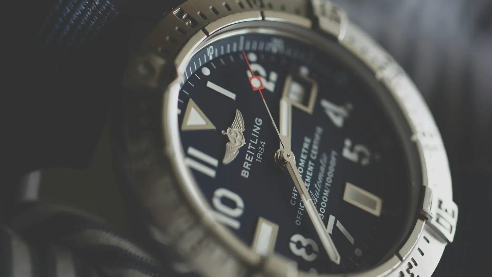
Breitling Winged Logo: Aviation, Movement and Adventure
Breitling's visual identity closely connects to the world of aviation and professional timepieces.
Founded in 1884, the company has a history of creating precision chronographs and maintaining close ties to aviation.
The winged imagery was used in the historic branding of Breitling, and it served to reinforce this identity. Wings imply flight, movement, freedom, speed, and adventure.
This approach provides the logo with a natural association with the world that the brand was seeking its watches to be associated with.
Breitling demonstrates the reason a logo is more powerful when its visual language corresponds to the purpose and personality of the product.
The moral of the story is that a good logo must help a brand story rather than merely adorning the product.
Famous Watch Logos Compared
The table below provides a fast method of comparing some of the most well-known watch logos, their key visual components, and the concepts they convey.
Watch Brand | Logo / Symbol | Main Association | Branding Approach |
Rolex | Crown | Prestige and achievement | Strong symbolic identity |
Omega | Ω Omega symbol | Technical achievement and completion. | Connection of names and symbols. |
Patek Philippe | Calatrava Cross | Heritage and craftsmanship | Historic emblem |
Vacheron Constantin | Maltese Cross | Mechanical precision and heritage | Engineering-based symbol |
Leitzeit | Leitzeit wordmark/logo | Timelessness and guiding time | Modern and transparent identity |
Cartier | Wordmark | Elegance and luxury | Typography-based identity |
Seiko | Wordmark | Simplicity and recognition | Clean visual branding |
Audemars Piguet | AP monogram | Luxury and exclusivity | Initial-based identity |
Breitling | Winged imagery | Aviation and adventure | Product-world connection |
This comparison also reveals that there is no specific formula to developing an effective watch logo.
Symbols are used in some brands. Others employ names, letters, or monograms. The most important thing is the relationship between the visual identity and the brand it represents.
What Makes These Watch Logos So Memorable?
Comparing these brands, you will be able to observe some common patterns.
The most successful watch logos tend to be simple, meaningful, consistent and related to the brand.
Simple Shapes Are Easy to Remember
Even on a tiny watch dial, a crown, a cross, a Greek letter, a pair of wings or a monogram can be recognizable.
This is important since a watch provides a designer with minimal space.
A logo that looks clear at a large size must also remain recognizable when it is only a few millimeters wide.
Strong Logos Connect With Brand History
The most fascinating logos tend to have a tale behind it.
Vacheron Constantin relates its Maltese Cross to a mechanical element. Since the 19th century, Patek Philippe has been using the Calatrava Cross. Omega relates its Ω sign to the history of the Omega movement.
These stories make the logos more meaningful.
You see a different logo when you know the story. You see more than just a shape. You get a glimpse of the history of the brand.
Consistency Builds Recognition
When a company uses a logo, it becomes recognizable.
You will find the same identity in watches, websites, ads, packaging, and other brand content. With time, the customers begin to identify the visual identity without having to read the entire company name. This uniformity also creates confidence since the customers are aware of what the symbol is.
The Best Logos Work at a Small Size
A watch insignia must be clear on a small dial. It must also work on website headers, product boxes, movement components, crowns, advertisements, and social media. This is why plain and even designs tend to be more effective than complex graphics.
What Do Different Watch Logo Symbols Represent?
The following comparison will help you comprehend the general concepts behind various types of watch logos.
Logo Type | What It Can Communicate |
Crown | Prestige, achievement, authority |
Cross | Heritage, tradition, craftsmanship |
Wings | Aviation, movement, freedom |
Greek Letter | History, philosophy, technical identity |
Monogram | Personality and exclusivity. |
Wordmark | Simplicity and brand recognition |
Mechanical Symbol | Technical and engineering skills. |
Modern Wordmark | Modern design and transparency. |
Keep in mind that not all brands have these meanings.
A crown will not turn a watch luxurious. A company creates that meaning via its products, history, customer experience, and its unchanging branding.
It is the same with all other symbols.
Watch Logos vs. Watch Design: Which Matters More?
A logo will make you identify a watch, but not a great watch.
The identity of a timepiece is provided by the case, dial, hands, crown, bracelet, movement, finishing, materials and proportions.
Consider a watch with the logo taken away. Certain iconic designs would still be recognizable since the shape of their cases, the arrangement of the dial, or the shape of their hands has become known.
Cartier provides a good example. Its watch identity is greatly pegged on design and its broader luxury design tradition.
This provides a significant balance:
A good logo recognizes the brand, and a good watch design provides the brand with something to remember.
We pursue this concept in a contemporary manner at Leitzeit. We regard a watch as more than an accessory. In our designs, we make mechanical watches that are durable, clear and timeless.
Our logo helps us to have that identity, but our watches and the values behind our watches give the identity a real meaning.
What Can Modern Watch Brands Learn From Iconic Logos?
The historical watch logo can teach contemporary brands some valuable lessons.
Build a Meaningful Identity
The brand story should be backed up by a logo.
When a company appreciates engineering, its visual identity must be precise. In the case of adventure, the design may be based on movement and exploration.
The key thing is to establish a real relationship between the symbol and the brand.
Make the Design Classic
Longevity is intrinsically linked to watchmaking.
A watch may be there with you for many years or generations. Its visual identity must therefore not be trendy and thus prone to becoming outdated in a short time.
We believe in timeless design at Leitzeit, as we think that good design must be useful and attractive in the long run. We do not imitate the past but mix the old concepts with modern design.
Let the Product Support the Logo
A nice logo will not be able to conceal a bad product indefinitely.
Customers ultimately judge a watch based on its movement, materials, accuracy, comfort, durability, finishing, and after-sales service.
That is to say branding must promise something that the product can deliver.
The powerful logo must be the one that reflects the actual value but not the one that creates an image the product cannot fulfill.
Be Honest About Manufacturing
The contemporary consumer is more and more interested in knowing the origin of goods and how they are produced by the company.
We think transparency is important at Leitzeit.
Our approach openly discusses our global manufacturing process. As part of our global strategy in watchmaking, we integrate German design, Japanese trends, and manufacturing skills in China.
We do not think that quality lies in concealing the origin of a component.
We concentrate on design, engineering, materials, manufacturing standards, quality control and long-term serviceability instead.
How We Approach Watch Branding at Leitzeit
We think a watch ought to say more than status at Leitzeit.
We are determined to produce mechanical watches that have a purpose, classic design and quality. This philosophy is represented in our name. The word "leitzeit" is German and translates to guiding time.
That is an idea that we apply to our brand and our watches.
We also believe in transparency. We do not rely on manufactured history or mythology. Our emphasis is on good design, engineering, materials, manufacturing, and honest sourcing. Longevity is also our philosophy.
Our automatic watches are designed to have long-term use, maintenance, and serviceability. This provides our branding with a definite purpose. The brand is represented by our logo, and our products and philosophy provide meaning to our logo.
In our case, it is a very simple goal: to produce watches that can be used as long-time companions instead of fashion items that fade away.
Final Thoughts
The stories behind famous watch logos show how even the smallest emblem can carry a remarkable history.
The most effective watch logos relate visual design to actual stories, products, engineering or brand values.
You can see the same simple lesson in the Rolex crown, the Ω of Omega, the Calatrava Cross of Patek Philippe, the Maltese Cross of Vacheron Constantin, the aviation-themed identity of Breitling, or the unique wordmark of Cartier: an iconic logo is strong when a brand makes it meaningful and when it upholds that meaning over time.
At Leitzeit, we are modern in that same concept. We are not interested in constructing a historical fiction. We create our identity based on design that is timeless, mechanical watchmaking, durability, transparency, and considerate engineering. We think that a watch should be a lifelong companion and not another throwaway item.
Looking for a watch that feels as distinctive as your style? Discover the latest Leitzeit timepiece, the Axis Mundi Worldtimer and experience the perfect blend of timeless character and contemporary watchmaking. Explore its unique world-time design today and make it your next favorite watch—one made to be worn, admired, and enjoyed for years to come.
FAQs
What are the most famous watch logos?
No single, official, most famous watch logo exists, but the Rolex crown is one of the most recognizable watch symbols in the world.
Other very well known examples are the Omega Ω, Patek Philippe Calatrava Cross, and Vacheron Constantin Maltese Cross.
What do luxury watch logos represent?
The logo of luxury watches can reflect the concepts of heritage, craftsmanship, accuracy, success, exclusivity, and design.
Nevertheless, the history of each logo is different. You are to consider the individual brand rather than think that all symbols are similar.
Why do watches have logos on the dial?
Watchmakers add logos on dials to recognize the brand and enhance the visual recognition.
The logo is also included in the overall design of the watch and contributes to the uniqueness of the product compared to other watches.
What does the Rolex crown logo mean?
The Rolex crown is the well-known logo of the brand. The logo was registered by Rolex in 1931, and it was used on Rolex dials in the 1930s.
The crown has since emerged as one of the most powerful visual symbols in luxury watchmaking.
What does the Omega logo mean?
The Greek letter Ω is used as the Omega logo.
The name was linked with an important movement that was presented in 1894, and the success of the movement contributed to making Omega the name of the company.
The Greek letter also has its connotations with completion since Omega is the last letter in the Greek alphabet.
What is the Patek Philippe logo?
The Calatrava Cross is the symbol of Patek Philippe.
The symbol was registered by the company in 1887, and it has been an essential element of the company brand for over a hundred years.
What does the Vacheron Constantin Maltese Cross mean?
In 1880, the Maltese Cross was adopted as the symbol of Vacheron Constantin.
The company states that the design was based on a component of a watch movement, which assisted in regulating the unwinding of the mainspring as well as aided in maintaining regular timekeeping.
Does a watch logo affect its value?
The perceived value of a watch can be enhanced by a logo since good brand recognition may have an effect on demand, collectability and resale value.
Nevertheless, a logo is not the sole factor that defines the value of a watch.
Value can also be influenced by condition, rarity, movement, materials, model, provenance, history, and market demand.
Can a watch be iconic without a famous logo?
Yes.
A watch may be identifiable due to its case shape, dial, hands, bracelet, movement or the general design.
A good logo can assist in brand recognition, yet a catchy product design can establish a brand identity.
What makes a good watch logo?
An effective watch logo must be identifiable, understandable, expandable and linked to the brand.
It must design on a small watch face as well as design on packaging, websites, advertisements, and other brand materials.
Why do watch brands use symbols instead of only names?
Symbols are fast to convey ideas and can be easily remembered even when the brand name is hard to read when it is small.
An effective symbol may also be used as a visual shortcut to the whole brand.